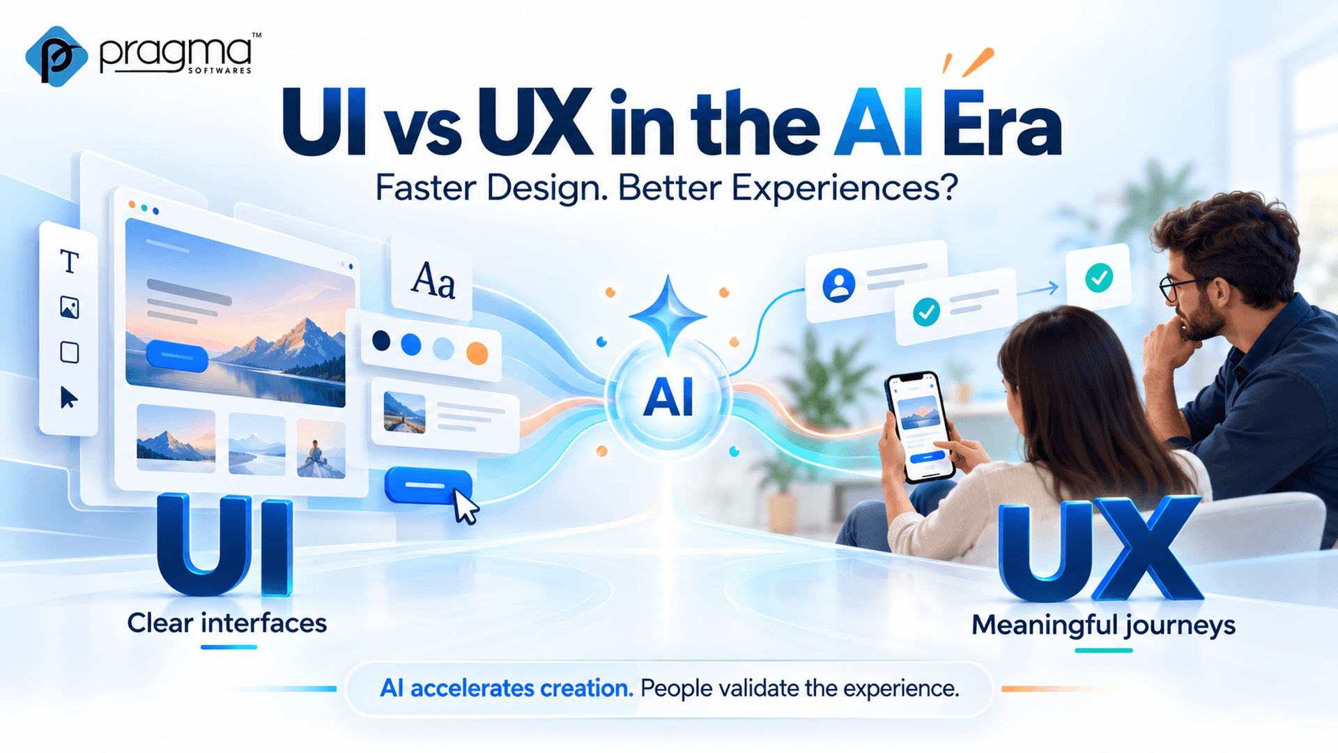
UI vs UX in the AI Era: Faster Design, Better Experiences?
Explore how AI is changing UI and UX design—and why usability, accessibility, and human judgment still matter beyond faster interface creation.
AI can generate a polished interface from a short prompt. Its usefulness depends on whether people can understand it, navigate it, and complete their tasks.
That distinction gives the familiar UI vs UX discussion fresh relevance.
Figma’s 2026 AI report explores how AI is changing collaboration between designers and developers. A September 2026 study also examined prompt-to-design workflows, finding shorter completion times among participants who completed the study tasks—with benefits varying by role and task.
Faster creation is useful. Teams still need to establish whether the resulting experience works.
UI and UX: The Difference Still Matters
User Interface (UI) covers the visual and interactive elements people use, including:
- Layouts and typography.
- Buttons and forms.
- Navigation.
- Feedback states.
User Experience (UX) considers the broader journey: people’s needs, the steps required to complete a task, the difficulties they encounter, and how well the product meets their expectations.
An AI-generated screen may look convincing while leaving important aspects unresolved. A complete review should assess:
- Navigation that reflects users’ priorities.
- Clear instructions and meaningful labels.
- Appropriate handling of missing information.
- Helpful error messages and recovery options.
- Keyboard and screen-reader accessibility.
A complete design needs to work beyond its initial appearance.
Trend 1: From Designing Screens to Reviewing Generated Experiences
AI-assisted prototyping changes where teams spend their effort.
Instead of starting every screen from scratch, designers can explore generated options and refine them. The review needs to go beyond visual preference.
For example, a generated registration page might include attractive fields and a prominent button. The team should also check:
- The purpose and necessity of each field.
- The placement and clarity of validation messages.
- The preservation of entered information after an error.
- The confirmation shown after successful submission.
Treat generated designs as proposals that need evaluation.
Trend 2: Closer Collaboration Between Design and Development
Figma’s 2026 research describes growing overlap between design and development activities.
For software teams, this creates an opportunity to involve developers earlier in design discussions.
A useful review can bring together:
- Designers to assess clarity and interaction.
- Developers to examine implementation and system behaviour.
- QA specialists to identify missing states and edge cases.
- Product stakeholders to confirm user and project requirements.
A working prototype becomes more valuable when these perspectives shape it before release.
Trend 3: Designing for AI Actions and Human Control
Interfaces that include AI agents introduce additional design responsibilities.
When a system can change records, send messages, or perform tasks, users need to understand its actions and the authority it holds.
A well-considered interface should make it easy to:
- Review a proposed action.
- Understand which information will be used.
- Approve consequential changes.
- Pause or cancel work.
- See what happened afterward.
- Recover where reversal is possible.
Research into workplace human–AI interaction is examining principles for designing these experiences, including how interfaces support trust and effective use.
Trend 4: Accessibility for Human and Agent Interaction
Nielsen Norman Group’s 2026 article on AI agents as users discusses how digital interfaces increasingly serve both people and agents, reinforcing the importance of accessibility.
For teams building websites, this is another reason to prioritise:
- Clear page structure.
- Meaningful labels.
- Predictable interactions.
- Keyboard accessibility.
- Understandable feedback and error messages.
Visual polish should be supported by sound implementation. A button needs appropriate behaviour and labelling alongside its appearance.
A Practical Example: An AI-Assisted Enquiry Form
Suppose a team generates a new enquiry form. Evaluating it requires several perspectives.
UI Review
Check the visual presentation and interactive elements:
- Spacing and alignment.
- Typography and readability.
- Colour contrast.
- Button and field states.
UX Review
Check whether visitors can complete the journey comfortably:
- Clear, understandable questions.
- Relevant requests for information.
- Helpful guidance when errors occur.
- Clear expectations after submission.
Technical Review
Check how the form behaves in practice:
- Input validation.
- Keyboard interaction.
- Data handling.
- Integration behaviour.
- Confirmation messages.
Testing the complete journey reveals issues that a static screen cannot show.
Priorities for AI-Assisted Design
When evaluating AI-assisted design, measure more than production speed.
Consider:
- Users’ ability to complete their tasks.
- Errors and points of confusion.
- Accessibility requirements.
- Feedback from people using the interface.
- The effort needed to revise the generated work.
A useful starting point is one important journey, such as requesting a consultation or completing a purchase. Observe people using it, identify obstacles, and test improvements.
AI can accelerate interface creation. Thoughtful design, accessible implementation, and testing with real users turn that speed into clearer, more usable digital experiences.